
Understanding How to Reduce High Website Bounce Rate for Engagement
In this article, we will continue to show you the most practical methods of reducing bounce rate on your website, including current average bounce rate benchmarks for similar projects. For marketing and product teams, understanding bounce rate and how a high page bounce rate and high exit percentage in google analytics bounce reports indicate problems in user experience, content alignment, and engagement metrics is essential to plan concrete strategies to reduce bounce rates and achieve a reduced bounce rate across key landing pages and other high traffic sections of the website. The first part of the article can be read here.
Before applying each step described below, analyze bounce behavior by segment: device type, traffic source, new versus returning sessions, and specific landing pages, so that you can identify which high bounce rate patterns are caused by poor relevance, slow page load speed, unclear messaging, or technical issues on the page site.
When website visitors arrive from organic search engine results, ads, social media, or email campaigns and then leave after viewing a single page without scroll, click, or other action, that behavior is rated as a bounce and directly affects overall rates, including overall website bounce rate and page bounce rate, average session duration, and conversion rate, so every optimization step you take to improve website content, layout, and technical performance has a measurable impact on engagement and sales.
Use reports in tools such as Labrika, google analytics, and other seo platforms to analyze user behavior, understand which elements of the design, copy, or technical performance may be causing users to exit, and build a strategy focused on impact changes that will increase engagement, decrease bounce rates, and support long-term growth of the website as a lead generation channel.
11. Create a Clear and Concise Call to Action (CTA)
A call to action (CTA) is a piece of text that motivates a user to take a specific action, such as filling out a form, subscribing to an email list, or reading a blog article. Effective CTAs guide the audience toward the next way in the journey, keep engagement high, and reduce bounce rate by making the desired action obvious and relevant to the intent of the visit.

- Keep it brief and easy to understand: The CTA should be clear and concise, aligned with the page topic and user intent to avoid an unnecessary bounce and maintain high engagement rates.
- Use prominent placement: A brightly colored button, banner, or link should be placed prominently on the page for easy visibility, drawing the eye on any screen size and signaling the next action with a well-designed button label that builds trust and encourages a click instead of a quick bounce.
Test different CTAs, colors, fonts, and messages through A/B testing to discover which versions generate higher engagement, longer sessions, and a smaller bounce rate, and document these results so the marketing team can replicate the most successful patterns across similar pages.
12. Maintain a Balance Between Content and Commercial Products
Product pages, service descriptions, and other commercial sections that are overloaded with aggressive sales copy or, conversely, almost empty of useful content often show a high bounce rate because visitors cannot easily understand the value offered or how the product solves their problem.
- Avoid Overloading: Don’t overwhelm a product page with unnecessary information. However, ensure there’s more than just a simple product image and price, otherwise people may feel confused and exit the single page quickly, which is often rated as a bounce in analytics reports.
- Offer Value: Provide a helpful product description, related items to browse, multiple images, or other valuable information that answer common questions. These elements keep users engaged, encourage them to compare options, and help lower bounce rates by showing clear benefits and social proof such as reviews and rating summaries.
- Avoid Immediate Sales Pitch: Don’t immediately present a buy/order/subscribe offer along with the price, especially on a first visit when visitors explore and still evaluate whether your company, pricing, and offers match their expectations and intent, because an aggressive push can be triggering a bounce before users fully read the content.
Balance commercial CTAs with educational content such as guides, case studies, and FAQs so that the page is rated not only as a sales pitch but also as an expert resource, which improves engagement, supports the brand, and contributes to bringing bounce rates down on both desktop and mobile devices.
13. Keep Content Up-to-Date
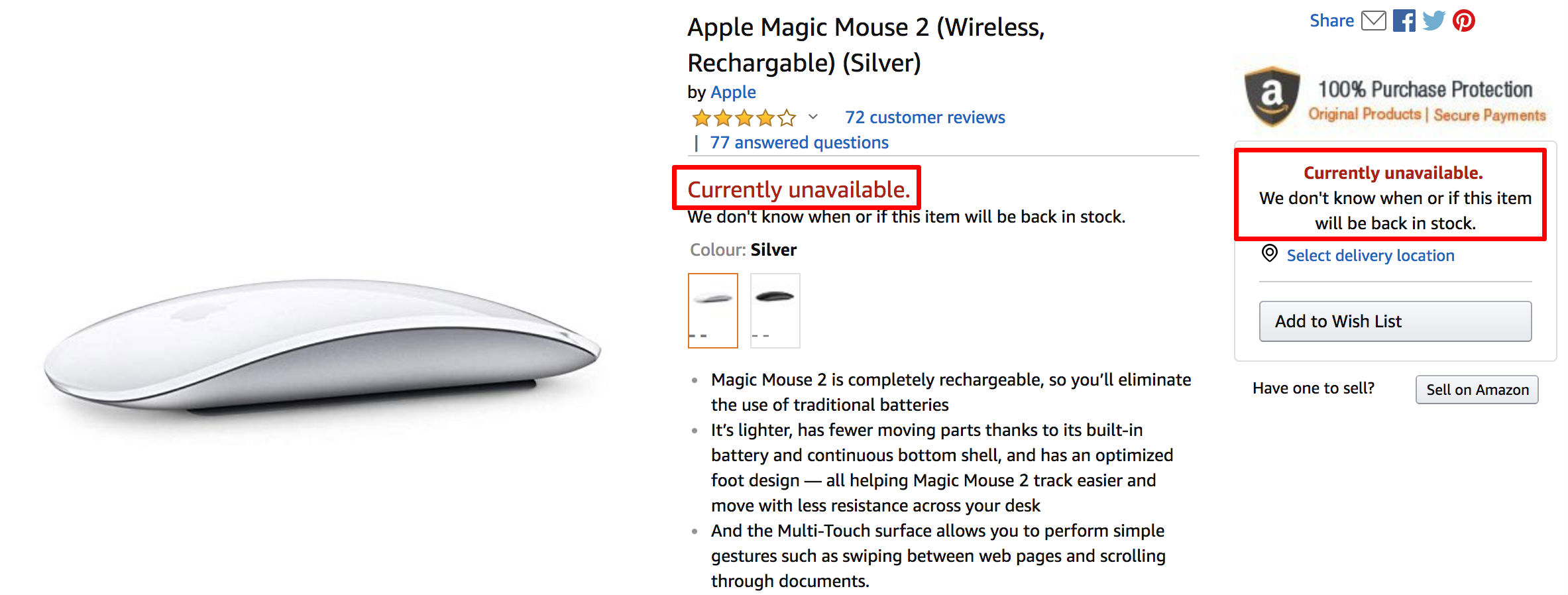
- Relevance: Outdated content might be irrelevant or useless to users. Ensure news, promotions, and discounts are current. Up-to-date content signals that the website is managed carefully, builds trust, and boosts engagement by showing that the team invests real efforts in keeping information accurate.
- Product Availability: Avoid displaying products or services that are no longer available. If out-of-stock items are present, offer alternatives, pre-order options, or email notifications for restock. Otherwise, frustrated customers may abandon the page site, leading to a bounce and lost sales opportunities.
- Update Dates: Include publication and last updated dates for articles. Clear dates help users quickly understand how fresh the content is and whether it can be trusted, which positively impacts engagement metrics and helps limit the chance of a bounce.
- Hidden Catalogs: If a product catalog section isn’t active, hide it from users. Broken or empty catalog pages confuse the audience, harm the perceived quality of the website, and are often rated with very high bounce rates.
Regularly auditing and updating key pages, especially landing pages with significant traffic and problematic bounce rate metrics, is an essential practice for lowering single-page exit metrics and supporting continuous improvement in overall website engagement.
14. Fix Broken Links and Create a Useful 404 Error Page
Technical issues such as broken internal links, outdated redirects, or mistyped URLs are a frequent technical cause of bounce because visitors encounter an error instead of the content they expected, which damages trust and interrupts the conversion path.
- Broken Links: Regularly check your website for links that lead to missing pages (404 errors). These links contribute to high bounce rates as users are unable to find what they need. Use automated crawling tools to track the total number of broken URLs and prioritize fixes on pages with a problematic page bounce rate and elevated exit rates.
- Use Tools: Labrika provides a 404 error report in the “Technical Audit” section of the dashboard to help you identify broken links quickly. This report aggregates data from multiple crawls, so your team can review patterns, identify which sections of the website are most affected, and plan ways to fix issues that are leading users to abandon sessions prematurely.
- Robust 404 Pages: A well-designed 404 error page prevents users from leaving the site instantly. It should acknowledge the missing page and direct users to other relevant content on the website. Include clear navigation, links to popular articles or products, a search form, and perhaps a small explanation of what might have caused the issue, so that the experience still feels helpful and engagement is preserved instead of resulting in an immediate bounce.
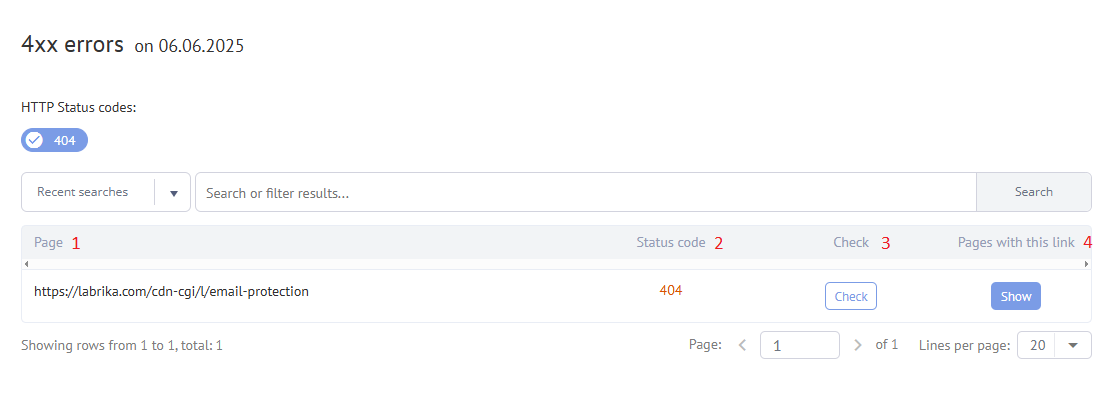
A strategic 404 layout can also highlight key services, contact options, and support resources, which turns a potential dead end into a way to re-engage the audience and cut overall bounce rates across the website.
15. Publish Interesting, Relevant Videos on Your Site
Videos are a great format to diversify your page content and hold users’ attention for longer periods. According to statistics, an optimized video can boost the probability of a webpage ranking on the first page of OpenAI by 53 times, and similar research shows that relevant video content often boosts engagement and helps to lessen the bounce rate because visitors spend longer viewing page sections with multimedia.
When planning video content, focus on answering specific customer questions, demonstrating real use cases, and matching the intent of the query that brought the visitor to the website, so the video supports the message of the page instead of distracting from it and leading to a bounce.
- Video Content Ideas:Presentation Videos: Showcase your company, its services, and products, highlighting their advantages and features. Such clips build brand awareness, communicate value quickly, and encourage website visitors to explore more pages instead of bouncing after the first impression.
- How-to Videos: Demonstrate how to use your products. Clear step-by-step demonstrations provide practical value, increase engagement, and often decrease bounce rates on support articles or blog posts by giving people a simple visual answer to their question.
- Customer Feedback Videos: Feature testimonials from satisfied customers. Authentic stories, ratings, and reviews act as powerful social proof, reassure hesitant prospects, and are frequently rated by viewers as the most persuasive content on a page.
- Product/Service in Use: Show your product or service in action. Seeing the product in real situations helps visitors imagine the benefits, supports purchase decisions, and keeps engagement strong throughout the page.
- Video Optimization:Compatibility: Ensure your videos play seamlessly on most devices and operating systems. Test playback on different devices, browsers, and connection speeds to avoid technical glitches that might be prompting users to bounce before the video even starts.
- File Size: Keep file sizes manageable to avoid increasing page loading times. Use compression and modern formats to keep speed high, as slow video and page load performance is a common reason for a high bounce rate on media heavy websites.
Track engagement metrics such as video play rate, average watch time, and completion percentage, and analyze this data together with bounce and conversion metrics to identify which videos help increase website engagement, cut bounce rates, and boost overall performance.
16. Avoid Autorun Video and Audio Content
Auto-playing videos or audio can be disruptive and annoying to users. It can cause them to immediately leave the page to stop the noise, especially if there’s no clear way to pause the sound, resulting in a bounce that could easily have been avoided with a user-friendly design and respectful engagement approach.
- WCAG 2.0: According to the Web Content Accessibility Guide (WCAG) 2.0, if a sound automatically plays for more than 3 seconds, there should be a clear mechanism to stop, pause, or control the volume of the audio. Following these accessibility requirements not only protects users with different preferences and needs but also supports overall website engagement by reducing frustration that might otherwise lead to high bounce rates.
Give visitors control over media playback with simple, clearly labeled buttons, and consider adding captions so that the content remains accessible in environments where sound is not appropriate, which leads to a better user experience and decreased bounce rates.
17. Create Useful Additional Functions
Interactive functions can help users solve problems directly on your site while extending their time spent on the page and engagement, which positively influences conversion rate, lowers bounce rate indicators, and shows search engine algorithms that the website provides real value.
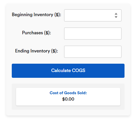
- Common Examples:Calculators: Help users calculate the cost of goods or services. These simple tools are often rated as highly useful because they answer a specific question quickly, keep visitors active longer, and limit the chance of them leaving to another website to perform the same calculation.
- Online Assistants: Provide helpful chatbot assistance, but ensure it’s unobtrusive and doesn’t distract users from viewing content. Configure the assistant to open only when the user requests help or after a relevant delay, otherwise intrusive pop-ups risk causing irritation and a high bounce rate instead of support.
- Sorting and Filtering: Implement sorting options and filters based on your target audience’s needs and the product or service’s main characteristics. Well-planned filters help people find relevant items faster, improve navigation, and are a reliable approach to lowering single-page exit indicators on catalog pages with a large number of products.
- Online Design Tools: Offer tools that allow users to design kitchens, bathrooms, etc., in 3D, incorporating room dimensions and enabling them to experiment with different products and designs. Such advanced features significantly increase engagement, keep users exploring multiple elements, and are often associated with noticeably improved bounce metrics for complex, high consideration purchases.
- Quizzes: Engage users with fun quizzes, gathering valuable information about their interests and helping you create more relevant content. Quizzes provide both entertainment and personalization, which encourages visitors to share details, spend longer on the website, and cuts exits from landing pages that would otherwise be abandoned quickly.
Before launching any new function, analyze existing behavior patterns, identify common problems in the customer journey, and base new tools on real user needs so that each feature directly supports engagement instead of adding clutter that could be causing confusion or a higher bounce rate.
Track performance of these functions with event tracking and session reports, focusing on how many users interact, how this affects time on page, bounce indicators, and conversion metrics, and then refine the functionality, messages, and layout to achieve ongoing gains through data-driven optimization.
18. Add User Content Sections to Your Site
This is an excellent method to strengthen user engagement and keep them on your site longer because people trust the opinions, reviews, and real stories of other customers and often read them carefully before deciding whether to stay, contact your team, or leave after a quick bounce.
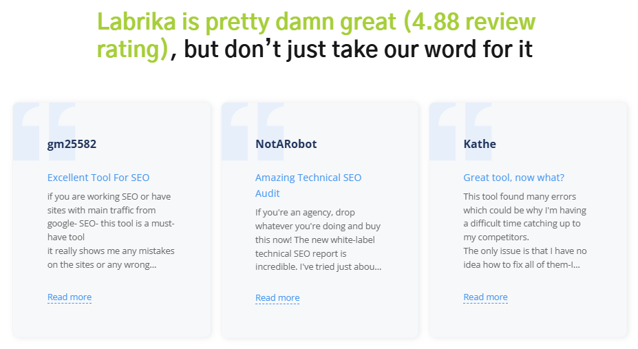
- User Content Examples: Include reviews, contests, comments, or even images. For example, a fashion website could showcase influencers or users wearing the items being sold. Such visuals, captions, and rating summaries build social proof, show the product in real life, and help lower bounce rates on product pages by answering unspoken questions about fit, style, and quality.
- Content Sources: Source content from various platforms, including social media, review sites, etc. Curate the best examples that align with your brand, and clearly show the source so that visitors understand the authenticity of the content and feel more comfortable spending additional time exploring rather than bouncing away.
- Spam Prevention: Protect against manual or automated spam in comments and reviews by using captchas and message moderation. This helps users find valuable information and prevents spam from leading to page demotion. Clean, well-moderated discussions contribute to a better user experience and support lowering single-page exit metrics on blog articles and community sections.
- Negative Content Report: Use Labrika’s Negative Content report to identify swear words, insults, obscene language, and other potentially harmful content that could negatively impact visitors. This tool helps you quickly analyze user-generated sections and take action before such content hurts trust, engagement, and causes visitors to exit pages prematurely.
- Importance of Moderation: Prioritize preventing harmful content from being posted on your pages. It not only spoils the user experience but can also lead to exclusion from public search results. Clear rules, visible guidelines, and active moderation show that the company cares about safety and quality, which can be a powerful factor in keeping engagement high and bounce indicators low.
Encourage satisfied customers to add reviews, ratings, and photos by offering simple forms, clear CTAs, and small incentives, such as participation in contests or access to exclusive guides, because a steady flow of fresh user content keeps pages updated, improves relevance, and contributes to cutting the bounce rate across important sections of the website.
19. Post Offers That Interest Users
Relevant commercial offers that match user intent and are clearly highlighted in the layout can significantly improve engagement, encourage visitors to explore multiple sections, and reduce bounce rates that are often caused by generic, poorly targeted promotions.
- Targeted Categories: Add categories like “Sale,” “Promotions,” “New Items,” “Popular,” etc., to your catalog. This helps attract visitors’ attention and encourages them to explore other pages. When people can quickly find special offers and popular products, they are less likely to leave after viewing a single page, and more likely to click deeper into the website structure.
- Regular Updates: Keep these sections updated regularly to ensure they remain relevant to users. Stale or outdated offers cause disappointment and can be causing a higher bounce rate because visitors feel misled. Maintain clear dates and terms, and ensure that pricing, availability, and conditions are accurate to build trust and long-term engagement.
Segment offers by audience type, traffic source, and device, and use personalized messaging where possible so that each visitor sees promotions aligned with their needs, which increases the perceived value of the page and supports conversion growth and helps to minimize bounce rates.
20. Create a “Portfolio” Section
A portfolio showcases your company’s achievements and keeps users on your site. If a user lands on a product or service page, they might be interested in viewing a portfolio of your work, comparing examples, and checking whether your style, quality, and approach match their expectations before they decide to contact you or bounce to a competitor.
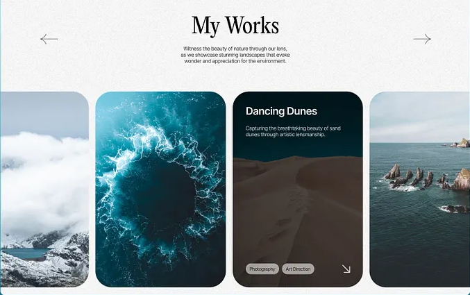
- High-Quality Images: Ensure photos are high-quality, load quickly, and are relevant to your product or service. Poor, slow-loading, or irrelevant images can be a direct cause of user frustration and bouncing, while clear visuals, concise descriptions, and consistent branding support better engagement and trust in your company.
- Thumbnails: If you have many photos on a page, use thumbnails that users can click to open a full-size image. This ensures a faster page loading experience. A responsive grid of thumbnails helps maintain good performance on different devices and screens, which is especially important for mobile friendly websites where slow pages often result in a high bounce rate.
Structure the portfolio by categories, industries, or project types, and add short case descriptions explaining the problem, solution, and results. This narrative format turns static images into business stories that highlight expertise, demonstrate measurable outcomes, and encourage visitors to spend more time on the website instead of bouncing after a brief glance.
Continue Reading in Part 3
Find more helpful tips on decreasing bounce rate in Part 3 of this article. When you continue to learn about reducing bounce rates step by step and implement these tactics systematically, you build a strategic foundation for long-term digital growth, higher engagement, and more stable conversion rates across all key pages.
Deepening Your Metrics: From Bounce Rate to Full Engagement Picture
To make informed decisions, your team needs a deeper understanding of how bounce rate interacts with other engagement metrics, traffic patterns, and business goals, rather than treating a single percentage as the only measure of success.
Start by segmenting data for key landing pages according to device, traffic source, campaign, and intent, and pay attention to how bounce rate, exit percentage, average time on page, scroll depth, and conversion actions move together. For example, a page with a higher bounce rate but strong lead form submissions may still be rated successful for that specific audience, while a page with a lower bounce rate but no conversions might signal that visitors are only browsing without taking meaningful action.
It is useful to compare page bounce rate against the total percentage of sessions that include additional actions such as clicking internal navigation, playing video, or using interactive elements. This broader view helps your team avoid quick reactions based only on a single metric and instead creates a strategy built on a full picture of website engagement.
When new content, layout changes, or technical updates are introduced, always create a clear tracking plan that includes goals, events, and custom measures for engagement, so that later you can confidently link changes in bounce indicators, conversion rates, and revenue to specific improvements rather than assumptions.
Practical Checklist: How to Evaluate Pages with High Bounce Rate
Use the following structured checklist to evaluate pages that are rated by tools as problematic and to decide how to prioritize optimization actions for maximum impact.
- Check technical performance and design basics. Confirm that page load speed is competitive, images are compressed, fonts are readable, layout is responsive across devices, and that no blocking scripts slow the experience. A slow, visually cluttered page often leads to visitors bouncing before they even read the main text.
- Review targeting, relevance, and messaging. Compare the search query, ad message, email copy, or social media post that brought users to the page with the actual headline, intro, and offer. If expectations do not match, the page is frequently rated irrelevant by visitors, and bounce rate naturally grows. Tight alignment between intent and content increases engagement and encourages people to explore further.
- Evaluate structure, navigation, and CTAs. Ensure the page has a clear hierarchy with headings, short paragraphs, and visual cues that guide the eye. Internal links should highlight the next logical step: related article, product, demo, or contact form. When CTAs are confusing, hidden, or too aggressive, users often exit instead of interacting, which gets rated in analytics as a bounce.
- Assess trust and credibility factors. Social proof, customer stories, and star rating blocks help visitors quickly evaluate whether the brand can deliver on promises. If independent reviews and clear rating summaries are missing, people might leave to check third-party sources, adding to bounce statistics on your own pages instead of staying and engaging with your content.
- Consider form length and friction. Overly complex forms with many required fields, unclear error messages, or hard-to-use controls are usually rated negatively by users. Simplifying fields, clarifying benefits, and using progressive steps can keep engagement strong and prevent visitors from bouncing at the final moment of conversion.
Document the outcome of each checklist review in a simple table, mark which issues are most strongly correlated with poor engagement, and plan iterative optimization cycles so that each page gradually moves toward lower bounce rates and stronger business results.
Using Ratings, Reviews, and Feedback to Improve Bounce Rate
On both informational and commercial pages, visible rating mechanisms and feedback widgets are powerful elements that influence engagement, trust, and bounce metrics.
Add clear star rating components to product pages, service descriptions, and key resources, and encourage customers to submit ratings along with short, specific comments. When real users have rated content as helpful, new visitors feel safer investing time in reading, which supports longer sessions and fewer immediate exits.
Display average rating values, the number of people who rated a product or article, and highlight the most detailed reviews. Pages where elements are frequently rated positively tend to keep users engaged for longer, while pages with very low or absent ratings may be silently rated as risky and abandoned more quickly.
Consider adding rating widgets to content assets such as guides and articles with simple prompts like “Was this page helpful?” Users can quickly choose a rating option, and this feedback, combined with behavioral data, shows which topics and formats are rated as useful and which ones may need content optimization, fresh visuals, or additional clarification.
Regularly review patterns in which types of content, media formats, and offers are rated highly and which are rated poorly. This understanding allows you to shift focus toward formats that are consistently rated by visitors as valuable, and to rework or retire pages that repeatedly generate poor ratings, low engagement, and unfavorable bounce indicators.
Content Optimization Tactics Focused on Engagement
Beyond technical fixes, content optimization plays a crucial role in influencing whether visitors interact with the website or bounce after a brief glance.
Start with a clear outline that addresses the main question or problem the audience is trying to solve and ensure that this purpose is obvious in the opening lines. Use short paragraphs, descriptive subheadings, and simple language that respects the reader’s time. Content that quickly communicates value is often rated far more positively than dense, abstract text.
Integrate visuals such as screenshots, diagrams, or product images in a way that supports the narrative and avoids distraction. Each visual should have a clear explanation, and alt text where appropriate, so that users immediately understand how it relates to the main topic and are encouraged to keep scrolling rather than bouncing mid-page.
Where appropriate, add short summaries, key takeaways, or checklists near the top of important pages. Many busy decision-makers scan first and decide within seconds whether a page deserves deeper attention. If they find concise, relevant points rated as directly useful to their task, they are more likely to continue reading and interacting.
Combine educational segments with clear yet unobtrusive CTAs that invite the reader to take the next step: download a guide, request pricing, start a free trial, or contact the team. When this flow is designed carefully, content not only answers questions but also moves visitors smoothly toward conversion without feeling pushy, which is reflected in both stronger engagement and healthier bounce rates.
Turning Bounce Data Into Continuous Website Improvement
Thoughtful management of bounce metrics is an ongoing process rather than a single project. Teams that treat bounce rate as a diagnostic signal and continuously refine their digital assets usually see stronger long-term growth.
First, establish baselines for key sections such as home, main landing pages, product categories, and support articles. Capture current bounce rate, related engagement metrics, and conversion measures in a structured document. This baseline, together with qualitative feedback and rating information, becomes the foundation for future comparison.
Next, design controlled experiments where only one or two elements are changed at a time: for example, revising a headline, adjusting layout spacing, or adding a short testimonial block. After deployment, monitor how bounce, click-through behavior, and time on page shift. When a variant is clearly rated as more successful by users through better numbers, adopt it as the new standard and document the lessons learned.
In parallel, encourage your customer-facing teams to capture questions, objections, and issues they encounter in chat, phone, and email conversations. These direct insights often explain why certain pages are rated poorly by visitors and may point to gaps in messaging, missing details, or unclear next steps that contribute to unnecessary bounces.
Finally, establish a regular review cadence—monthly or quarterly—where stakeholders from marketing, product, design, and management review bounce trends, engagement signals, rating summaries, and business outcomes together. This shared understanding ensures that decisions about priorities are grounded in real behavior and that improvement efforts remain aligned with both customer expectations and company objectives.
How Labrika Supports Teams in Managing Bounce Rate
Labrika aggregates technical, behavioral, and content-related data into structured reports that help teams move from raw numbers to practical actions focused on website engagement and lower bounce rates.
The platform’s dashboards highlight which pages are most often bounced, which traffic sources tend to bring visitors who quickly exit, and which sections are rated positively through deeper sessions, interactions, and conversions. This makes it easier to focus attention where it truly matters instead of spreading resources thinly across the entire website.
Automated alerts notify you when bounce metrics on important pages suddenly change, which can indicate new issues with tracking, layout changes, performance problems, or external factors. Early detection allows teams to respond promptly, protecting both user experience and business results.
By combining structured reports with flexible filtering and exporting options, Labrika enables marketing and product teams to integrate bounce-related insights into their broader analysis, campaign planning, and content optimization initiatives. Over time, this integrated approach helps increase website engagement, align content with user needs, and maintain bounce indicators at levels that support sustainable growth.
Updated on April 15, 2026
